
Guide to brand design for a startup project.
Because developing a brand and transforming a logo into a brand is also crucial for deep tech startups and technology transfer projects.
Let’s imagine you want to make a cake and take it to a party with lots of guests.
You may surely have in mind what it should look like, the flavor (which you or the other people might like the most) and you know the list of all ingredients; some of these, maybe, you already have at home, others you will have to buy.
You’re also aware that you will need a lot of utensils to prepare it such as, for example, an oven; but… but you don’t know the recipe and, above all, you have never made a cake before!
Therefore, you have no idea of the dosages, of the order in which to add the various ingredients, of the cooking temperature and you don’t know how to use all the necessary tools (and perhaps you do not even know which ones you really need).
What will the final result be? Probably a cake that no one will appreciate (you in the first place), resulting in a waste of energy and time (beyond the bad figure).
Indeed, it’s even more likely that in the end you decide not to show up to the party with the cake, thinking that, all in all, it’s something not so important, that maybe you can easily put off until next year.
The metaphor fits perfectly with today’s situation in the panorama of technology transfer and startups, in which many innovators – who are while aware of the need to take care of the branding aspect – decide not to invest time and resources in the Brand Design of their enterprise’s project.
This happens for 3 main reasons:
- it is thought that the brand comes after the idea, after the product and much after the market, being unaware that, by doing so, the general and integrated vision of the necessary elements to create a level business project is lost;
- especially in deep tech startups, the design and management of fundamental elements in brand design (such as logotype, website, company profile, business card, slide deck, “meet the team” videos and LinkedIn profiles) are assigned to internal resources teams which perform this task without having the right skills;
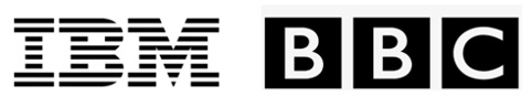
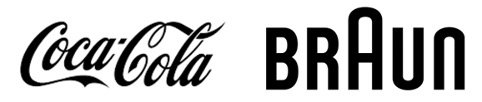
- We are convinced – more or less reasonably – that the logic of Branding is the prerogative of the top brands which rely a lot on branding, such as Starbucks, Coca Cola, Harley Davidson and Apple for example;
While it’s true that a startup (especially non-digital and non-BTC) may not make the brand one of its main assets, it is also true that completely ignoring the aspect of brand design and the transformation of a logo into a brand means totally depriving your business project of a competitive edge capable of allowing the construction of a proposal, which will be able to summarize and transmit a visual and textual code that the startup will be using to characterize itself and to introduce itself to the public.
Therefore, given that the brand and good communication of the product or the team are asked to create part of the business capital (whatever this is), let’s see concretely how to develop these aspects within the operation of a startup or a technology transfer project, in order to stand up and give value to your own technology and your own business idea.
4 key concepts to bear in mind for the Brand Design of a startup, with summary sheets and cases that we have dealt with in Day One in the years of work with some of the most innovative Italian and European technology transfer projects.
The Logo: arrival point and starting point for a startup
Although it is necessary to emphasize that the brand is not the logo, the latter certainly represents the main visual and textual code with which the startup connotes and presents itself to the external and internal world (a particular not to be underestimated, as we will see later).
A logo commonly indicates the graphic sign of a brand.
The word “logo” is actually the abbreviation of the word “logotype”, deriving from “logos” (from the Greek “word”) and “type” (which stands for typeface). So, technically, the logo is a particular typographical display of a brand’s name.
Together with your CV and the novelty (in technological and market terms) inherent in the idea, the logo is, at the same time, both the arrival and the starting point for the startup.
- It is a point of arrival because it is not a logo created by chance. The visual synthesis offered by a logo is the result of a journey. It comes from a job of cleaning and identifying the characteristics of a project.
- It is the starting point because it is the first element of the graphic identity of our business project, the first sign that tells its characteristics, personality and nuances.
It means having put in place a symbol with which we will be recognized and perceived by external stakeholders, but also by the members of our own team, who will have the company imprinting with the logo and will recognize each other in it, as well as in the values, in the mission and in the vision of the startup.
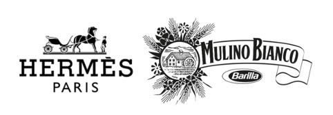
Given the creative nature and the infinite variables involved in the design of a logo, it is not possible to exhaustively list all the technical-graphic combinations with which designing a brand, but it is certainly useful to identify macro-areas to classify the main types of logotype (with some examples that we all might recognize):
MONOGRAM
Particular typographic assembly of one or more initial letters of a name
WORD LOGO
Logo based only on a logotype, i.e. only on a particular spelling of the name, therefore without any figurative element. In this case, the lettering is essential to characterize and memorize it.
![]()
ILLUSTRATED LOGOTYPE
Logotype combined with a stylized and recognizable graphic symbol
ABSTRACT LOGO
Logotype combined with an abstract symbol, that is, not attributable to a universally recognizable object
![]()
ILLUSTRATED LOGO
The visual composition is represented by a particular drawing, an illustration or a photograph. The disadvantages of using this logo (very allegorical) are the difficulties that its small size and its printing (more expensive and complex) bring about.
So, for example, in the presence of a name chosen for the startup that is very long or difficult to read, it won’t be convenient to adopt the “word logo”, or when it comes to very advanced technologies (where the complexity consists in translating) you can resort to an illustrated logotype or an abstract one.
In addition, we must pay close attention to the color (or colors) that we choose to adopt for our logo, since it is from them that the chromatic identity of our startup and all the information/communication materials connected to it will derive.
The language of colors is part of the DNA of all living beings: some insects, for example, display bright shades of yellow to indicate danger and intimidate predators; or in order to paint the walls of a wellness center or a psychologist’s office, it is common to resort to those not too exciting like red, but reassuring like blue or green.
Therefore, the colors of our startup also convey information and create lasting identities. In the world dominated by visual inputs that are (fortunately) automatically filtered by our brain, it is important not to overdo the number of colors of the logo, choosing a maximum of two.
OFTEN MEDICAL: LOGO DESIGN CASE STUDY
OFTEN Medical represents a case that has seen us as protagonists really closely and that sums up very well what has been said so far about the logo for a startup born from a university research project.
OFTEN Medical technology is based on optical fiber. Therefore, together with the team, we decided to develop a concept connected to technology in a minimal way, with a simple and easy-to-read geometric figure – a circle – that refers to the fiber.
Moreover, the circular element refers to the letter O, which is the initial of the startup name and the circle is “the perfect geometric figure” (Giotto docet) that fully represents the idea of absolute precision, just as the device that assists anesthetists during the complete epidural procedure, from the placement of the needle in the space, to the positioning of the epidural catheter.
As being a highly innovative project – which aims to remove the tension due to possible errors that might occur during epidural anesthesia – we opted for a light octane green, an artificial color not present in nature, in order to underline the novelty of the product compared to what has ever been created so far.
![]()
Not all startups can afford to spend thousands of dollars for a complete logo/visual identity design. For this reason, many of them resort to the myriad of websites that generate free (or low-cost) logos, without taking into account the fact that others have access to the same clipart and images offered. You will probably end up finding your logo very soon!
Other founders decide to take the so-called “Cousin’s road”, that is to make a logo with a minimum expense, relying on graphic designers who have very little experience in the professional creation of brand identity.
At Day One we deeply believe in the power of quality and attention to detail and we’ve learned from experience how much design can light up a creative intuition and make a project shine.
The visual identity that we will study together has to express the startup’s personality, create curiosity and generate positive impact, especially with regard to potential investors.
THE WEBSITE FOR THE STARTUP: A DOOR TO THE WORLD
Speaking of the importance of a web site for a startup, we must necessarily start from a data: in Italy in 2020 only one out of three startups had a website and 20% of them were not working.
Therefore, it can be said that – at least in Italy – the presence on the web is not considered so important by start-uppers, especially in deep tech.
For example, a startup or a spin-off coming from the world of academic research that is developing a technology for very specific applications, it may think it doesn’t need a website, considering scientific publications, academic knowledge and contacts developed during the end-user validation phase sufficient (if done right).
However, although word of mouth among insiders is very important, there are many valid reasons to work on building a website:
- Regardless of which part of the world the potential interlocutor for our startup comes from, the website allows us to be found without limits of space and time (having access to information at any time of the day, 7 days a week);
- It shows updated information on product development and company activities. Showing such content through brochures or flyers can become obsolete in a short time and, in order to renew it, it will be necessary to update its graphics and send it back to print. All this is free of charge and quick to execute using a website;
- It is an essential element for the brand identity and for integrated communication, since it is from it (as well as from the logo) that graphics and communication style derive.
When they hear about a startup or a technology transfer project through word of mouth or participation in events, investors or stakeholders in the sector then go and look for further information on the internet. It is very important to provide this information through a website, perhaps also connected to the social profiles of the members of the business project team, in particular LinkedIn and ResearchGate.
The website is, to all intents and purposes, the online business card in all B2B and B2C actions, when it comes to contacting distant stakeholders by sending the link of your website via email or any App.
The doors of the project will open with just a simple click!
The creation of the website is also a great synthesis exercise and, like all synthesis exercises, it allows us to understand how clear the project we are carrying out is, first of all for ourselves.
Regardless of the market, therefore, while working on the structuring of the Value Proposition (see the in-depth analysis) and the implementation of the business plan, it is a good idea to simultaneously prepare the contents of the site. It will save time and will help to understand and simplify the message behind the business idea, in order to communicate it to investors and to approach the first customers.
It’s not important to have a particularly innovative and interactive site: the important thing is that it is updated and well-finished to the point of transmitting a positive image of the project. The SEO-FIRST and USER-FIRST approaches must be the mantra of the design and project.
First of all, the site must be indexed (to do so use the Google Search Console) and then optimized in terms of SEO. Always keep in mind that much of the traffic comes from mobile and, also for the organic optimization on Google, it’s important that the site performs well on portable devices too. Pay particular attention to the loading speed, as over 50% of users abandon a site when it takes more than 3 seconds to load.
In Day One, we daily plumb the depths of the network looking for startups and technology transfer projects that we contact for collaborations, design synergies or comparisons on the market applications of the technologies developed and which can be interesting for the large companies we collaborate with for Open Innovation activities. Using a site which is clear and well-positioned through keywords research, linked to both the areas of innovation/research and the product market, is certainly the “door to the world” that, professionals like us, knock on to offer interesting business opportunities that, without a site, would never see the light of day.
SOCIAL OR NON-SOCIAL?
THIS IS (NOT) THE DILEMMA!
Can a social page replace a website? Many start-uppers or aspiring ones answer this question saying “yes”, also because it is free, easy to create and allows, in fact, to host many of the features of a showcase site.
A well-finished LinkedIn Page is certainly an important element of the project’s media kit, as well as the personal profiles of team members. However, no social network can replace a website, for a very simple reason: the social network is not our home, but a shared space that – although useful in terms of visibility – will subject us to its rules and standards with regard to texts, images, interactions and look&feel.
It should also be pointed out that not everyone has a social profile or doesn’t use it constantly; in this way, therefore, there is a risk of cutting out a part, albeit a minor one, of stakeholders who won’t be able to see what your technology and your business project consists of. In short, social networks and the web work better together!
How could a startup make the best use of social media for brand design activities?
We’re going to talk about it better in a dedicated article, as there are so many mistakes that are made by novice start-uppers when they start using social networks for their business.
THE FINAL ADVICE, BUT GOOD TO START…
Watch and learn from what other players in the sector are doing, trying to identify those actions that seem to be more interesting for you and for “the cake” that you have imagined to make, with those who will be able to guide you in reading and preparing the recipe!
The others not only are the big successful companies, but also startups or technology transfer projects that you will come across and that have particularly impressed you.
Take notes on what you think is done right and what is wrong. The aim is not to copy anything, but to study the sector, learn from the experiences of others and have clearer ideas when we go to work, together, on the brand design for your amazing startup!